Improved usability
Delivered more intuitive workflows that reduced user errors during onboarding and tool adoption.
Hackaday. API Website Development
My Role
UX/UI Designer
Timeline
3 Months
Tools
Figma
Case Study Time
6 min
Hackaday.io has over one million members.
Its API platform has been newly branded and designed from scratch to provide a better developer experience. The Hackaday.io API onboarding process is tailored for Hackaday enthusiasts and researchers who want to leverage our APIs. The previous version only included a login screen, application creation, and API documentation, which often led to frequent user errors.
The updated version takes a user-centric approach, enhancing consistency, user control, and flexibility while prioritizing error prevention.


1. API Documents page was based on a fixed template, limiting design flexibility
→ Solution: Optimised the API Documents page with branding adjustments and implemented the most user-friendly design options.
2. Copying and pasting API Key, Client Secret, and Client ID on the documents page caused back-and-forth delays.
→ Solution: Improved efficiency by adding a sticky header for easy copying of API Keys and IDs.
3. Users needed an easier way to create new apps and access existing ones.
→ Solution: Designed a dashboard to allow users to manage apps more intuitively.
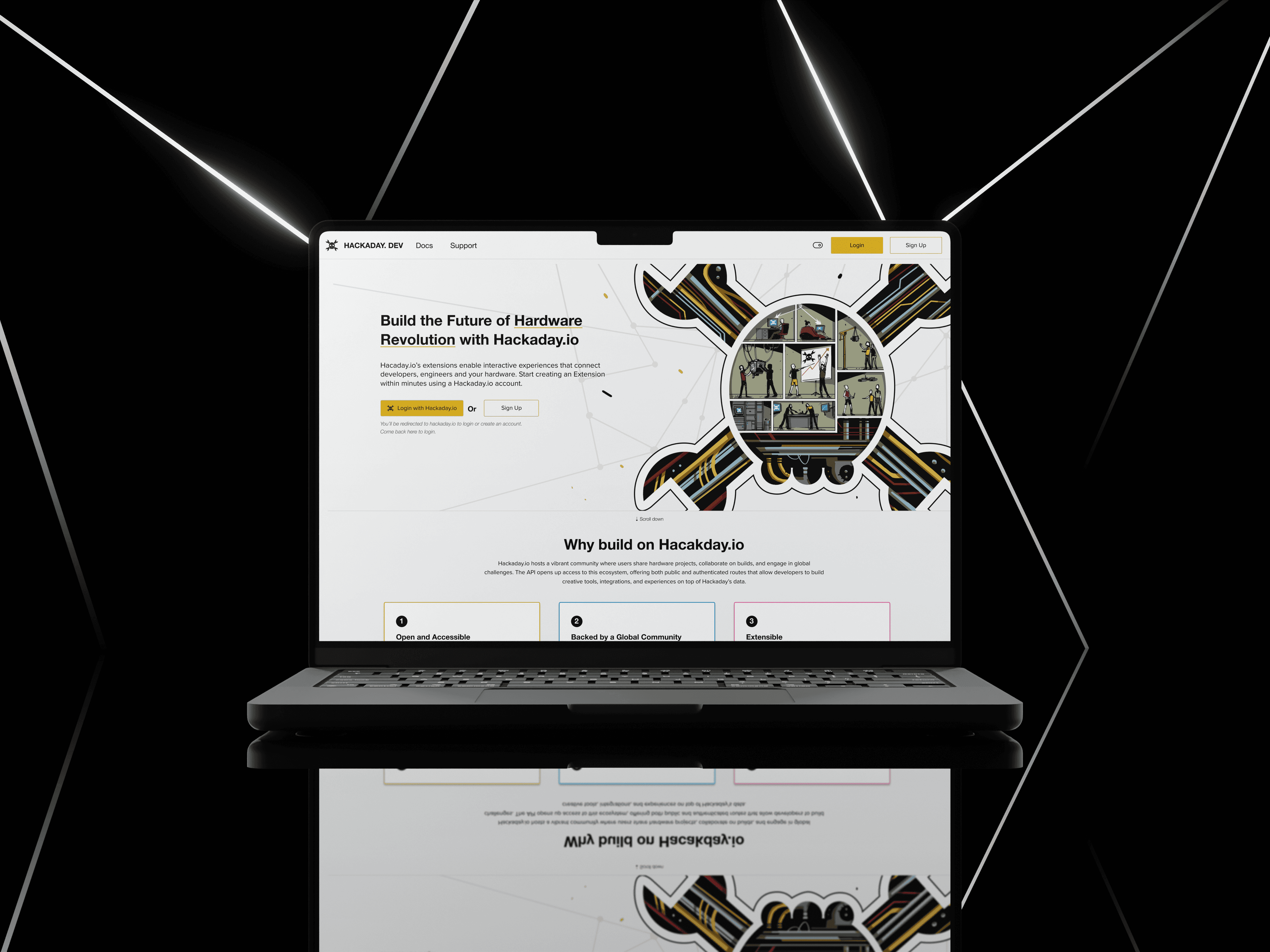
4. Branding was unfamiliar to users.
→ Solution: Enhanced accessibility by replacing the non-brand blue with high-contrast yellow and supporting both dark and light modes.
5. Users had to login or sign up via Hackaday, but there was no clear indicator for this.
→ Solution: Added both “Login with Hackaday” and “Sign Up” buttons, along with helpful text below to clarify what users should expect before clicking.

Previous Version
New Version
Previous Version
New Version
Previous Version
New Version


