
Summary
Redefining electric car experiences with intuitive UI design.
Background
Why Ford?
☞ EV Market Needs
We chose Ford because it is new to the EV market, ready to develop new systems, and committed to continuous iteration.
The Current Problem
☞ No Friendly Interface
Modern infotainment systems often distract drivers and contribute to accidents caused by reduced focus on the road.
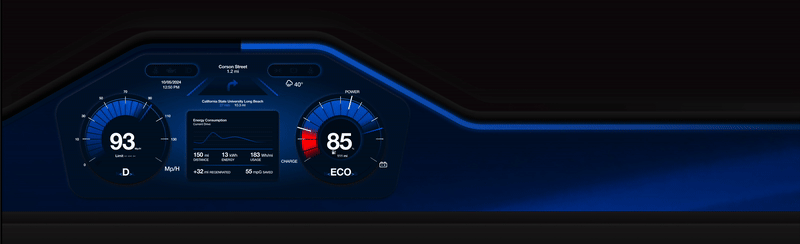
More Intuitive Solution
☞ Research based & Problem Focused
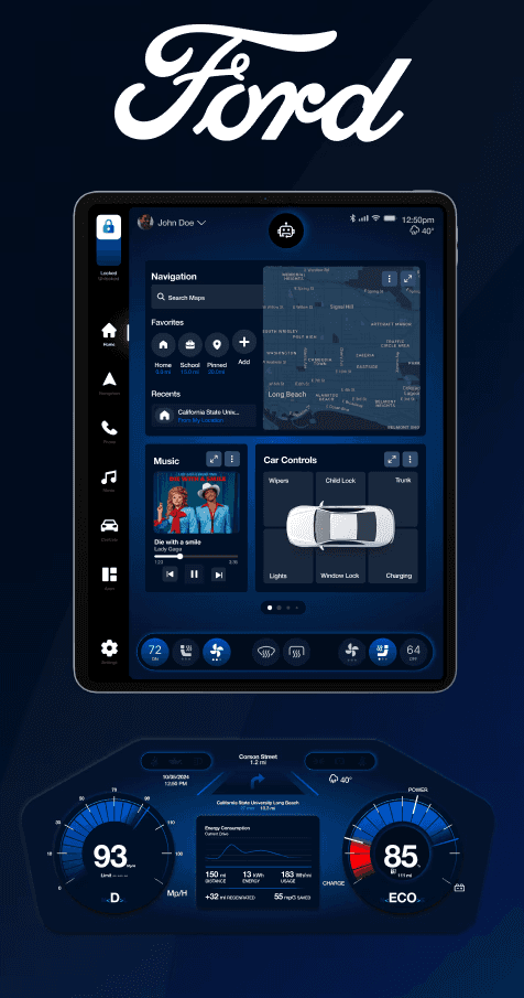
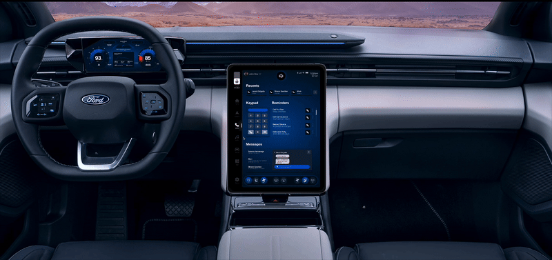
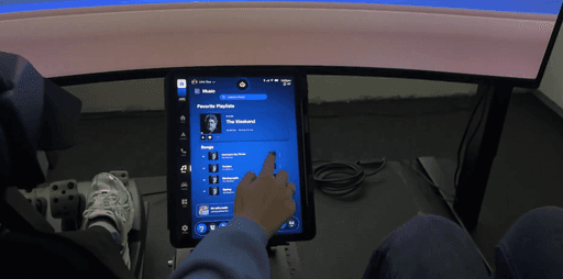
We designed a user-friendly in-car interface that integrates intuitive navigation, media controls, and essential settings. This system enhances safety and minimizes distraction.
Field Research Conducted
Before starting the design process, I explored various electric car interfaces to understand industry standards and observed their pros and cons.
This helped me to understand market competitors.

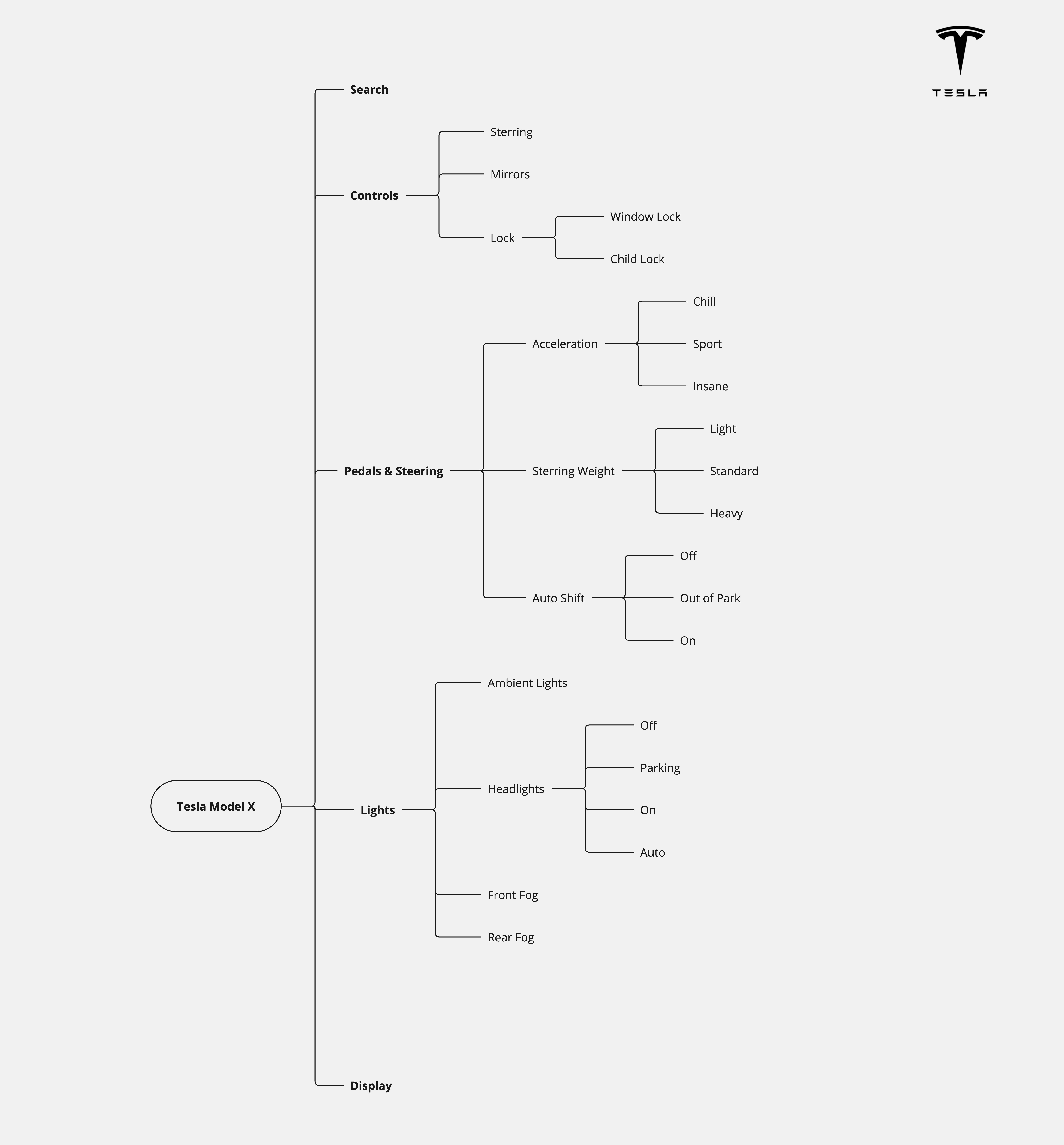
System Design
Creating car deconstruction flows helped me compare the pros and cons of cars and gain a better understanding of their working mechanisms.
User Research Plan
I collected data from users to serve a broader group, enhancing their usability experience.
Data Collected
I collected data from users to serve a broader group, enhancing their usability experience.The questions helped me understand customization, voice features, car satisfaction, common uses, and pain points.
In a fully autonomous car, what features would enhance your driving experience?
360 cams
Self-parking
Watching movies
Safety
Tinted windows
Sound insulation
Seat comfort
Climate control
Blind spot help
Easily call people
Comfort interior design
Voice assistant
They’re checking for your because of the....
Music
11
Maps
10
Youtube
4
One click to basic functions
While driving, they frequently checking their music, maps & youtube in their phone.
Persona
The persona and emotion map helped me analyze pain points more effectively.


Challenge statement
How might we provide easy access to car controls and allow users to customize dashboards according to their needs while addressing their main problems?
Initial Sketches
Sketches helped me visualize user pain points, allowing me to start iterating on where each core function should be placed.


Wireframing & Iterating
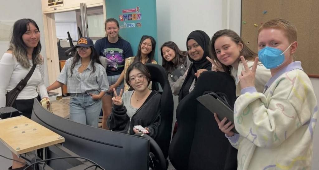
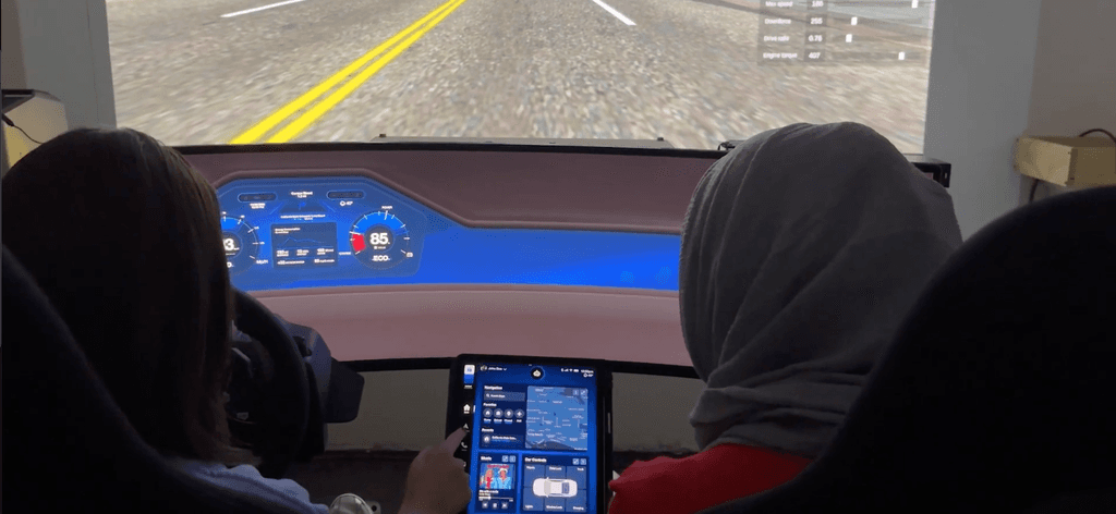
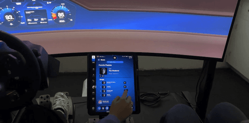
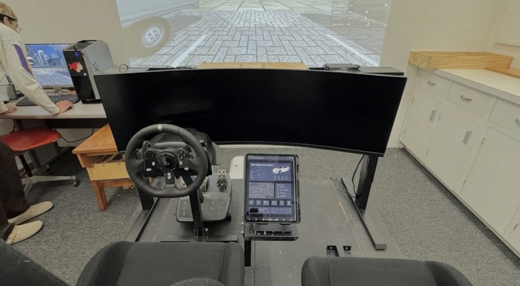
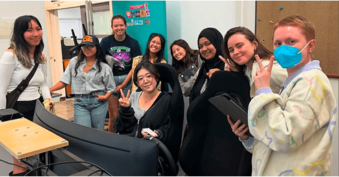
After the initial sketches and wireframes, I tested the product in a car buck. This helped us refine the project by identifying what is accessible and what is not.


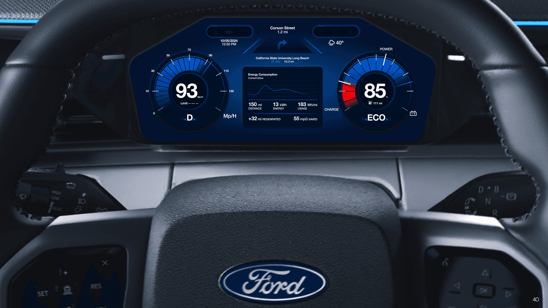
Design Strategy
Validated Structure used.

Prototype

Heuristic Evaluation
Analyzed user experience through heuristic evaluation in the context of specific user scenarios
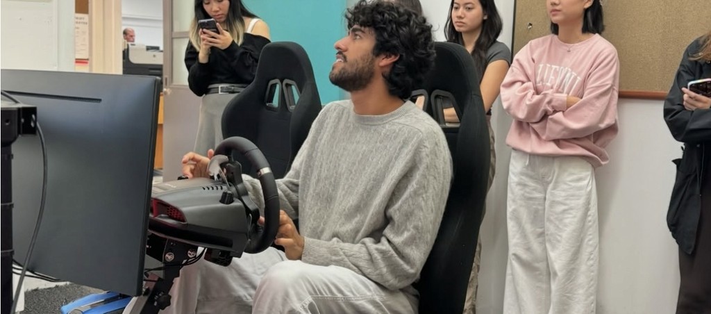
Testing
We tested the car dashboard UI using the Car Buck driving simulator with more than 10 participants. Their feedback, combined with A/B testing and heuristic evaluations, guided key improvements.
%80
of tasks were successfully completed by users.
100%
found it easy to navigate between pages.
2
users struggled with controlling the AI for parking
Lessons Learned
01-Gained insights into user behavior in real-time driving scenarios.
02-Balancing functionality, accessibility, and simplicity for larger screens.
03-Iterative Testing
Constraints
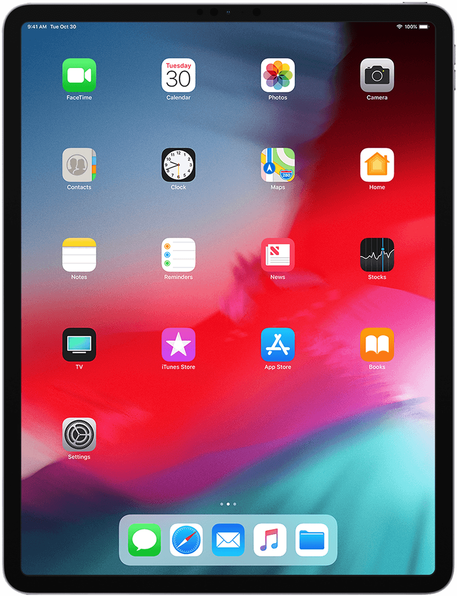
01-Designing an accessible interface for in-car use with the larger iPad-sized screen.
02-Ensuring usability and minimizing distractions required extensive iteration